
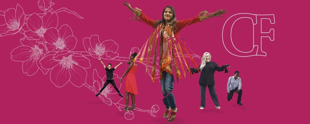
CherryField is the family business that provides fashion to the world’s leading brands and global retailers
Cherryfield is the family business that provides fashion to the world’s leading brands and global retailers.
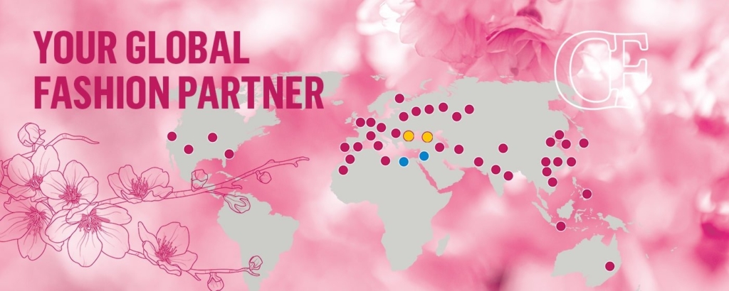
We’ve lived and breathed textiles for over 30 years, with sales and marketing offices in the United Kingdom, United States, Germany and Israel, and manufacturing across the globe. Personal and direct as only a family can be, we tailor our fit to each customer’s unique needs – offering a full service from concept to shelf.
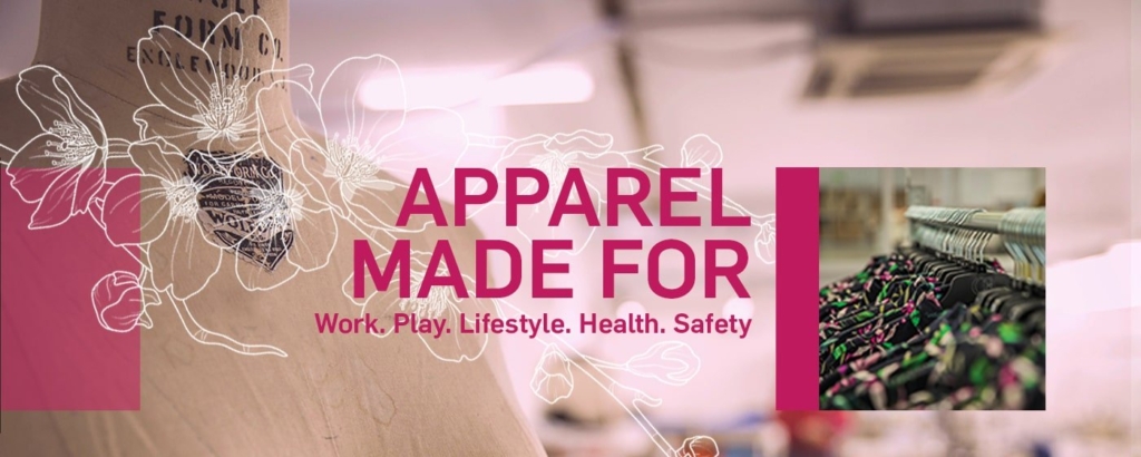
Whether it’s for men, women or children, formal, casual or safety, we’re the family that dress 42 million people worldwide.


From Concept
To Shelf
- Global sourcing of raw materials
- Product innovation and design
- In-house seasonal collection
- Hand selected long-term manufacturing partners
- Market research
- Presence in all relevant manufacturing territories
- Quality assurance and quality control
- Strict social compliance
- 24/7 global availability
Reiss
Asos
Nordstrom
FatFace
PVH
Ksubi
Pepe Jeans
Cintas
Fristas
M&S

Next
Sosander